LinkedIn Connections EDA
Python
Pandas
NumPy
Plotly
Streamlit
Python
Pandas
NumPy
Plotly
Streamlit
find this project on my Github page
Description:
This project offers a dashboard that contains a variety of interactive charts and descriptive statistics based on the LinkedIn connections dataset that anyone with a LinkedIn account can get for free in under 10 minutes.
Project’s Goal:
Enable anyone with a LinkedIn account to get valuable insights about their connections, allowing them to make data-driven decisions and hopefully get into a better position in their professional career.
Dashboard Features:
- Upload your own connections dataset.
- Filter the Dashboard based on companies, positions, and dates.
- Sample data tables
- Multiple charts: scatter plot, bar plot, tree plot¸ word cloud, network plot, histogram plot.
- Statistics: # connections, # connections with email, # unique companies, # unique positions.
- Descriptive statistics: a summary of some charts containing min, max, average, and direction of the trend.
Project Code:
"""
This code imports necessary libraries and defines functions to
perform exploratory data analysis on LinkedIn connection data.
It loads the data, cleans it, calculates summary statistics,
visualizes the data through plots and graphs, and allows the user
to filter and analyze subsets of data.
Key functions and features:
- File upload and data loading
- Data cleaning and preprocessing
- Calculation of summary statistics
- Filtering data by company and position
- Visualizations: bar charts, treemaps, wordclouds, network graph
"""
from streamlit_option_menu import option_menu
import streamlit as st
import pandas as pd
import plotly.express as px
import warnings
from wordcloud import WordCloud,STOPWORDS,ImageColorGenerator
import matplotlib.pyplot as plt
import networkx as nx
from pyvis import network as net
import streamlit.components.v1 as components
warnings.filterwarnings("ignore")
import os
selected = option_menu(
menu_title=None, # required
options=["Instructions" ,"Dashboard"], # required
icons=["house", "book"], # optional
menu_icon="cast", # optional
default_index=0, # optional
orientation="horizontal",
styles={
"container": {"padding":"100px","padding": "0!important", "background-color": "#2D2E32"},
"icon": {"color": "orange", "font-size": "25px"},
"nav-link": {
"font-size": "25px",
"text-align": "left",
"margin": "0px",
'color':"#71FCAA",
# "--hover-color": "#eee",
},
"nav-link-selected": {"background-color": "green"},
},
)
if selected == "Instructions":
st.title(":bar_chart: LinkedIn Network Exploratory Data Analysis")
st.write("""## How to use:
1. you will need your LinkedIn Connections CSV file which can be downloaded by following these steps:
- Click the Me icon at the top of your LinkedIn homepage on the desktop browser.
- Select Settings & Privacy from the dropdown.
- Click Data privacy on the left pane.
- Under the How LinkedIn uses your data section, click Get a copy of your data.
- Select Want something in particular? ...
- Select Connections.
2. upload the **connections.csv** file to the Streamlit web app
###### Note: the connections CSV file might take up to 10 minutes to be ready after requesting it using the steps above; you must refresh the LinkedIn browser for the download button to appear after waiting.
##### Congrats :partying_face: Now you are ready to go and see the exciting graphs and visuals
### This site's code can be accessed using [Github Link](https://github.com/michelhaj/Linkedin_DataAnalysis)
##### Created by Michel Al-haj """)
if selected == "Dashboard":
# st.title(":bar_chart: LinkedIn Network Data Analysis")
# st.markdown('<style>div.block-container{padding-top:1rem}</style>',unsafe_allow_html=True)
uploaded_file=st.file_uploader(":file_folder: Upload your file",type=["csv","xlsx","txt","xls"])
if uploaded_file is not None:
filename=uploaded_file.name
st.write(filename)
try:
df=pd.read_csv(uploaded_file,skiprows=3)
except Exception as e:
print(e)
df=pd.read_excel(uploaded_file,skiprows=3)
else:
df=pd.read_csv("Connections_base.csv",skiprows=3)
df.columns=df.columns.str.replace(" ","_").str.lower()
col1,col2=st.columns((2))
nrows,ncolumns=df.shape[0],df.shape[1]
nwithemails=df[df.email_address.notnull()].shape[0]
n_uniqecompanies=len(df.company.unique())
n_uniquepositions=len(df.position.unique())
print(df.email_address.isnull().sum())
if df.email_address.isnull().sum()>=(nrows//2):
df.drop(columns=["email_address"],inplace=True)
df.dropna(axis="rows",inplace=True)
df.connected_on=pd.to_datetime(df.connected_on)
startdate=pd.to_datetime(df.connected_on).min()
endtdate=pd.to_datetime(df.connected_on).max()
with col1:
date1=pd.to_datetime(st.date_input("Start Date",startdate))
col1_sub_1, col2_sub_1 =col1.columns(2)
col1_sub_1.metric(label=":male-technologist: Total Connections",value= f"{nrows}")
col2_sub_1.metric(label=":incoming_envelope: Connection with Emails",value= f"{nwithemails}")
with col2:
date2=pd.to_datetime(st.date_input("End Date",endtdate))
col1_sub_2, col2_sub_2 =col2.columns(2)
col1_sub_2.metric(label=":office: Unique companies connections work with", value=n_uniqecompanies)
col2_sub_2.metric("Unique positions of connections", n_uniquepositions)
df=df[df.connected_on.between(date1,date2)].copy()
# print(df.info)
company_list=st.sidebar.multiselect("Pick a company",df.company.unique())
if not company_list:
df2=df.copy()
else:
df2=df[df.company.isin(company_list)]
position_list=st.sidebar.multiselect("Pick a position",df2.position.unique())
if not position_list:
df3=df2.copy()
else:
df3=df2[df2.position.isin(position_list)]
if not company_list and not position_list:
filtered_df=df
elif company_list and position_list:
filtered_df=df[df.company.isin(company_list) & df2.position.isin(position_list)]
elif company_list:
filtered_df=df[df.company.isin(company_list)]
else:
filtered_df=df[df2.position.isin(position_list)]
with col1:
print(filtered_df.groupby(by="connected_on").count().reset_index())
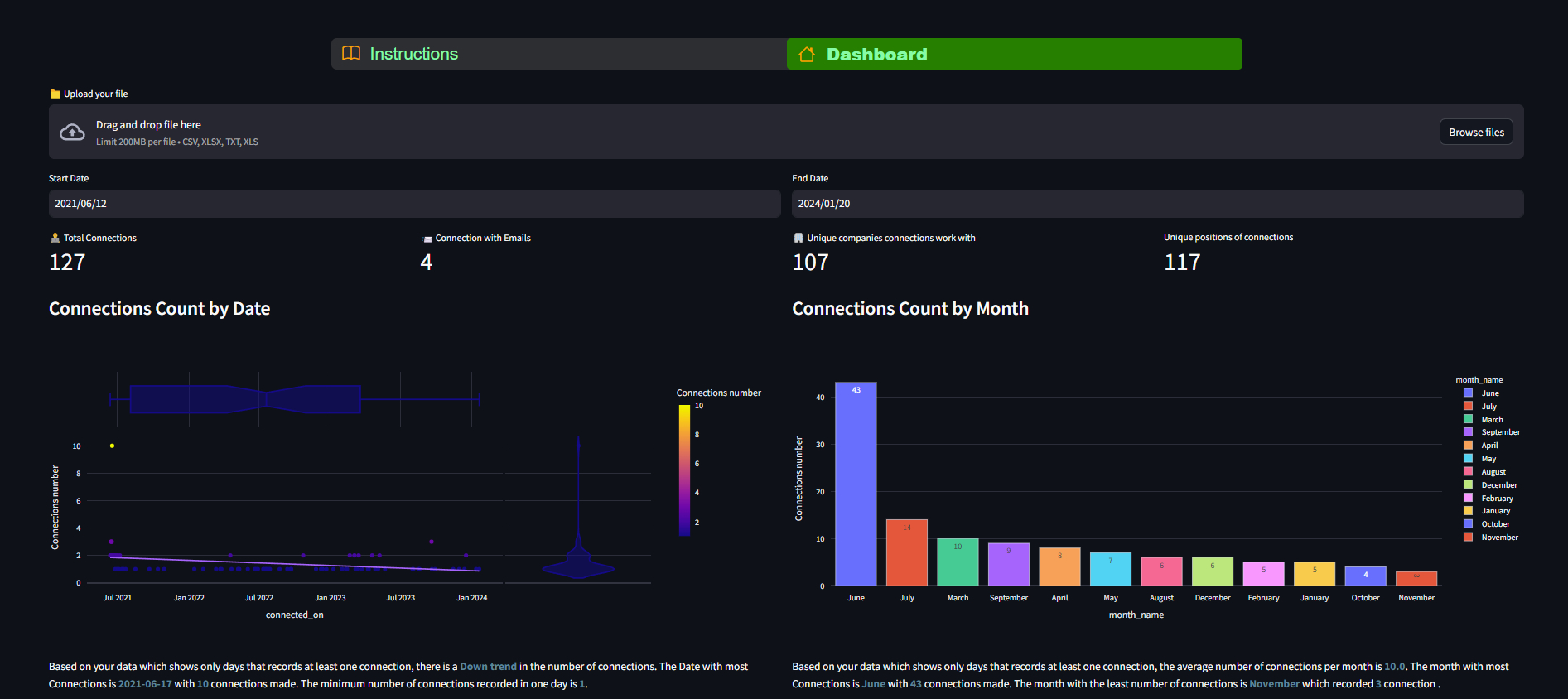
st.subheader("Connections Count by Date")
fig=px.bar(filtered_df.groupby(by="connected_on").count().reset_index(),x="connected_on",y="position",labels={'position':'count'})
st.plotly_chart(fig,use_container_width=True,height=400)
filtered_df["month_name"]=filtered_df.connected_on.dt.month_name()
with col2:
st.subheader("Connections Count by Month")
fig=px.bar(filtered_df.groupby(by="month_name").count().reset_index().sort_values(by="connected_on",ascending=False),template="gridon",x="month_name",y="position",color="month_name",labels={'position':'count'})
st.plotly_chart(fig,use_container_width=True,height=300)
# def comp_count_func():
cl1,cl2=st.columns(2)
top_companies=(filtered_df.merge(filtered_df.company.value_counts(),on="company").sort_values(by="count",ascending=False).reset_index(drop=True))
top_companies["occurences"]=1
top_companies["used_in_treemap_company"]=top_companies.apply(lambda x: 1 if x.company in top_companies.company.values[:len(top_companies.company.values)//5] else 0,axis=1)
top_companies=top_companies[top_companies.used_in_treemap_company==1]
# top_companies=filtered_df.groupby(by=["company",'position']).count().reset_index().sort_values(by="company",ascending=False).reset_index(drop=True)
top_positions=filtered_df.groupby(by="position").count().reset_index().sort_values(by="connected_on",ascending=False).reset_index(drop=True)
with cl1:
st.subheader("Top Companies / Organizations in your Network")
if len(top_companies)<5:
st.write("No enough data to show")
else:
fig=px.treemap(top_companies,path=["company","position","first_name"],values="occurences")#, values="connected_on",template="ggplot2",labels={"connected_on":"count"})
st.plotly_chart(fig,use_container_width=True,height=300)
pass
with cl2:
st.subheader("Top Positions in Your Network")
if len(top_positions)<5:
st.write("No enough data to show")
else:
fig=px.treemap(top_positions[:(len(top_positions)//6)],path=["position","company"], values="company",template="ggplot2",labels={"company":"count"})
st.plotly_chart(fig,use_container_width=True,height=300)
# import plotly.figure_factory as ff
st.subheader("Connections Data Table")
with st.expander("Data_Table"):
df_sample=filtered_df.drop(columns=["url"])
st.write(df_sample)
wc1,wc2=st.columns(2)
with wc1:
st.subheader(f"Most Frequent Names in Your Network" )
x=' '.join(filtered_df.first_name.to_list())
stopwords=STOPWORDS
wc=WordCloud(background_color='white',stopwords=stopwords,height=1000,width=1500)
wc.generate(x)
fig, ax = plt.subplots()
plt.imshow(wc,interpolation='bilinear')
plt.axis("off")
st.pyplot(fig)
top_companies=filtered_df.company.value_counts().reset_index()
filtered_top_companies=top_companies.loc[top_companies['count'] >=2]
filtered_df["full_name"]=filtered_df.first_name+" "+filtered_df.last_name
print(set([(i,j)for i, j in filtered_df[filtered_df.company=="PwC"][['full_name',"position"]].values]))
with wc2:
st.subheader(f"Most Frequent Names and Positions in Your Network by Compny" )
g=nx.Graph()
g.add_node("root")
for _,row in filtered_top_companies.iterrows():
company=row['company']
count=row['count']
title=f"{company} -({count})"
# positons=set(filtered_df[filtered_df.company==company][["position",'full_name']].values)
# names=set(filtered_df[filtered_df.company==company]['full_name'])
position1="\n.".join([f"{i} -- {j}" for i, j in filtered_df[filtered_df.company==company][['full_name',"position"]].values])
hover_info=f"{company}\n {position1}"
g.add_node(company,size=count*2,title=hover_info,color="#ffa500")
g.add_edge("root",company,color="yellow")
nt=net.Network(height='500px',width='100%',notebook=True)
nt.from_nx(g)
nt.save_graph("graph.html")
HtmlFile = open("graph.html", 'r', encoding='utf-8')
source_code = HtmlFile.read()
components.html(source_code,width=600,height=500)
import plotly.graph_objects as go
st.subheader("Recency of Connections")
filtered_df["connection_age"]=(pd.to_datetime("today")-filtered_df.connected_on).dt.days
ages_in_days=filtered_df.connection_age.values
labels=[]
for age in ages_in_days:
if age > 365:
years = int(age / 365)
labels.append(f'{years} years')
else:
months = int(age / 30)
labels.append(f'{months} months')
# Create the scatter plot
fig = go.Figure()
fig.add_trace(go.Scatter(
x=filtered_df.full_name.values,
y=ages_in_days,
mode='markers',
text=labels,
marker=dict(
size=7,
color='blue'
)
))
# Customize layout if needed
fig.update_layout(
xaxis=dict(title='Full Name of Connections'),
yaxis=dict(title='Age (days)')
)
# filtered_df["connection_age"]=filtered_df["connection_age"].apply(lambda x: x//365 if x>=365 else x//30)
# fig=px.scatter(filtered_df,x="full_name",y="connection_age",labels={'connection_age':'days',"full_name":"name"})
st.plotly_chart(fig,use_container_width=True,height=300)
l,r=st.columns(2)
filtered_df["year"]=filtered_df.connected_on.dt.year
network_by_year=filtered_df.groupby(by="year").count().reset_index().sort_values(by="connected_on",ascending=False).reset_index(drop=True)
with l:
st.subheader("Network Growth by Year")
fig=px.histogram(filtered_df.connected_on,x="connected_on",nbins=len(filtered_df.year.unique()),template="gridon",labels={'connected_on':'count'})
st.plotly_chart(fig,use_container_width=True,height=300)
with r:
st.subheader("Network Growth by Year Sample Data")
with st.expander("connections_count_By_Year_Table"):
st.write(network_by_year[["year",'connected_on']].rename(columns={"connected_on":"count"}).style.background_gradient(cmap='Blues'))
csv=network_by_year.to_csv(index=False).encode('utf-8')
st.download_button(label="Download Data",data=csv,file_name="connections_count_By_Year.csv",mime="txt/csv",help="Click here to Download the data as csv file")
Comments (0)